Visualization
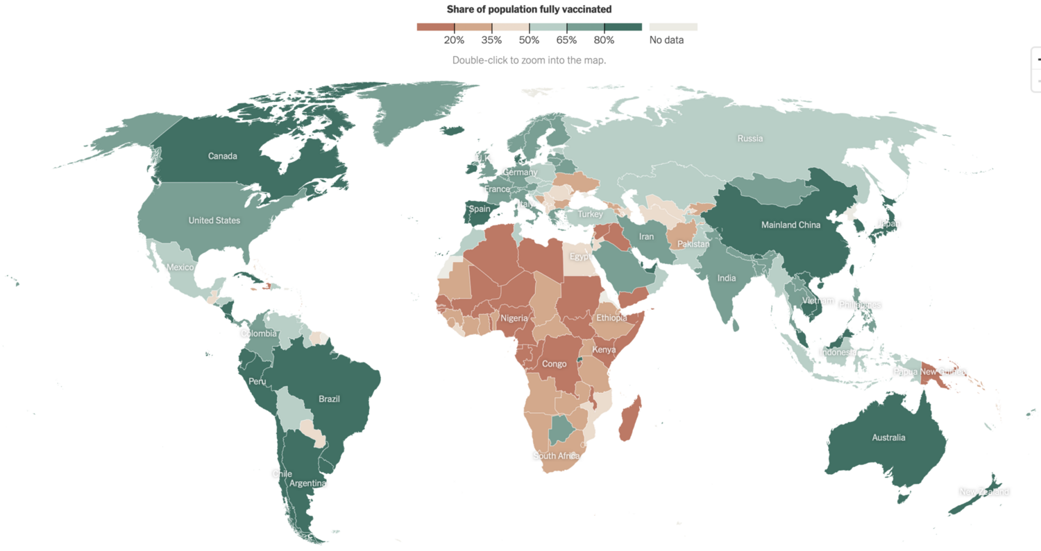
The above visualization map shows the fully vaccinated statistics in different countries from New York Times. I like this visualization for below reasons:
The choice of hues to represent different percentage ranges makes the information shown in the visualization easy to understand and comprehend.
Utilizing a map visualization, we are able to quickly identify the geolocation reference and pre-attentive clusters. Therefore, even if it isn't stated explicitly, it is evident from map visualization that vaccination rates are lower in low-income countries.
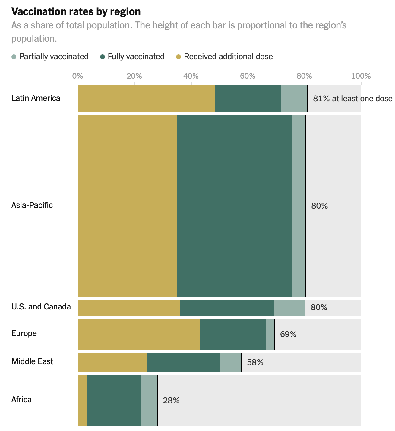
Additionally, the page also displays vaccination rates by region (the visualization to the left ). The good feature about this is that each bar's height is shown in relation to the population of the region rather than being the same for all of them.